
In this tutorial we follow on from importing financial data to then graphing financial data in timeseries chart format with plotly candlestick charts. https://plotly.com/python/candlestick-charts/
import the dependencies
Ensure that plotly is installed, if not follow guidelines in last video Python for Finance: Get stock market data.
import datetime as dt
import pandas as pd
from pandas_datareader import data as pdr
import plotly.offline as pyo
import plotly.graph_objects as go
from plotly.subplots import make_subplots

pyo.init_notebook_mode(connected=True)

pd.options.plotting.backend = 'plotly'
get stock market data
Choose a date range and select stock to chart.
end = dt.datetime.now()
start = dt.datetime(2015,1,1)

df = pdr.get_data_yahoo('CBA.AX', start, end)
df.head()
Create Moving Average terms
For this we use pandas .rolling function and specify the rolling window parameter. https://pandas.pydata.org/docs/reference/api/pandas.DataFrame.rolling.html By choosing a rolling window of 50/200, inherently this requires 50/200 rows of data before it can compute the mean. We end up with NaN (Not a Number), we can resolve this (if we would like to have a continuous MA line throughout this period) by specifying the min_periods parameter.
df['MA50'] = df['Close'].rolling(window=50, min_periods=0).mean()
df['MA200'] = df['Close'].rolling(window=200, min_periods=0).mean()
df['MA200'].head(30)
Create plotly fig / subplot
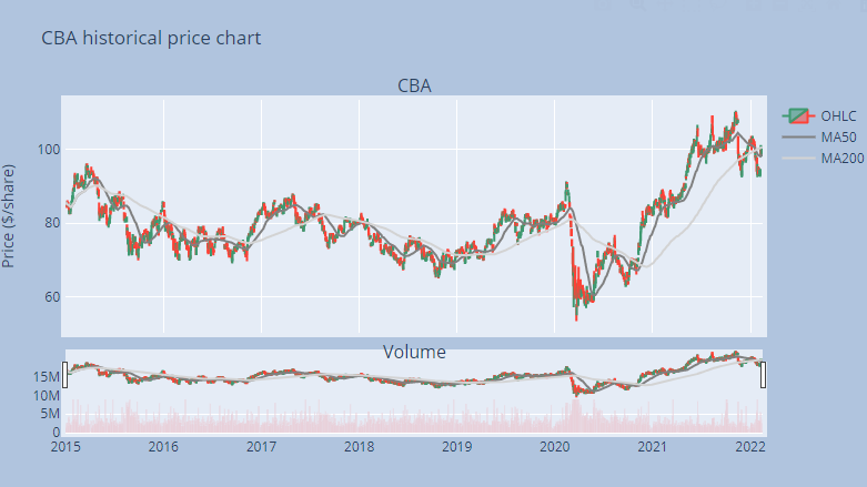
fig = make_subplots(rows=2, cols=1, shared_xaxes=True,
               vertical_spacing=0.10, subplot_titles=('CBA', 'Volume'),
               row_width=[0.2, 0.7])

fig.add_trace(go.Candlestick(x=df.index, open=df["Open"], high=df["High"],
                low=df["Low"], close=df["Close"], name="OHLC"),
                row=1, col=1)

fig.add_trace(go.Scatter(x=df.index, y=df["MA50"], marker_color='grey',name="MA50"), row=1, col=1)
fig.add_trace(go.Scatter(x=df.index, y=df["MA200"], marker_color='lightgrey',name="MA200"), row=1, col=1)

fig.add_trace(go.Bar(x=df.index, y=df['Volume'], marker_color='red', showlegend=False), row=2, col=1)

fig.update_layout(
    title='CBA historical price chart',
    xaxis_tickfont_size=12,
    yaxis=dict(
        title='Price ($/share)',
        titlefont_size=14,
        tickfont_size=12,
    ),
    autosize=False,
    width=800,
    height=500,
    margin=dict(l=50, r=50, b=100, t=100, pad=4),
    paper_bgcolor='LightSteelBlue'
)

fig.update(layout_xaxis_rangeslider_visible=True)
fig.show(renderer="colab")